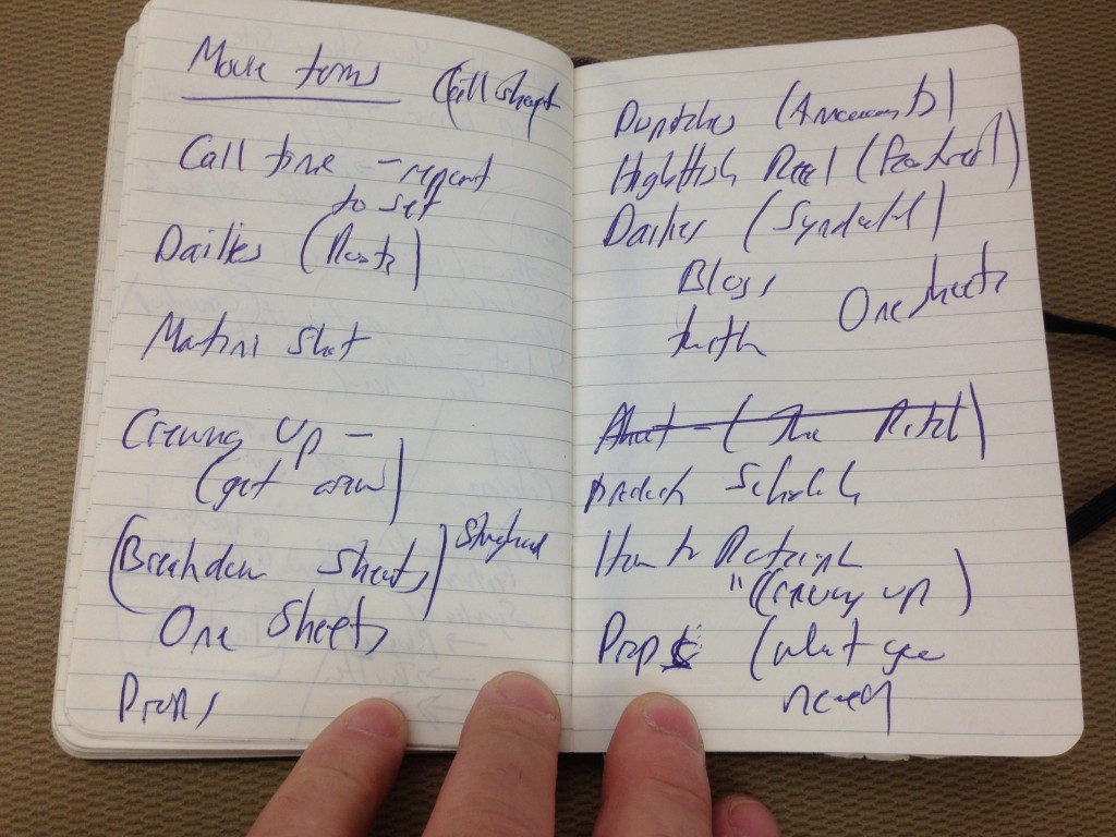
At a talk tonight on TRU campus I decided to use my moleskin for notes and was delighted to find my early ideas for the You Show web site; the notes are dated December 8, 2014. According to the Network sites listing, we set up the trubox.ca domain and we installed WordPress as multisite there On December 6, and added the You Show site the next day.
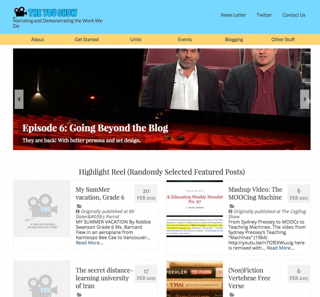
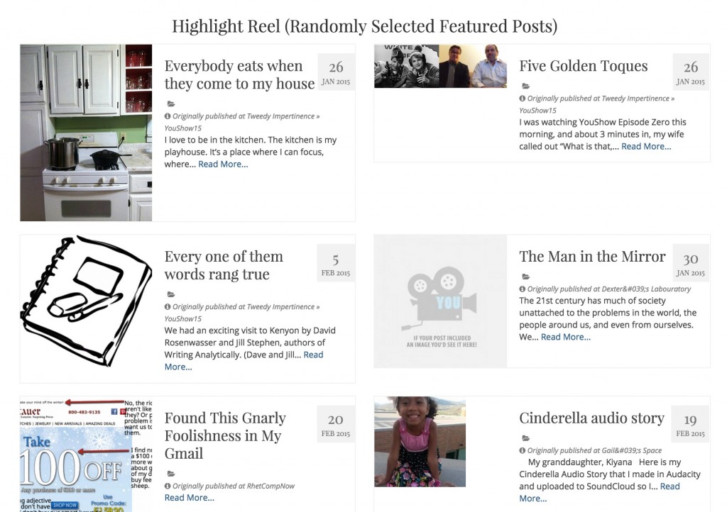
A usual I created a Child Theme (of the Virtue Theme) for the You Show site– my customizations have things like footer modifications, the code needed for the syndication signup, a Magic Box. I made some mods to the front page blog display to pull random posts from the given category (the highlighted syndicated posts). And because of randomness, a link to a randomly selected syndicated blog post.
I did some coding tricks to add a admin feature to the syndicated posts so they could be one-click added to the highlight category (which is where the blog posts on the front come from).
It was officially let loose on the web on January 6, 2015.
The site uses the Virtue Theme (a free one from the WordPress themes collection), and was one of maybe 12 I added early as possible themes useful for portfolios. At first review the things I liked about it was the top slider (which could be images or recent/featured posts), and it had configurable area to add an icon row to link to inner content, recent posts listed with images, multiple menus. The Theme options give a good amount of flexibility to changing up the settings, and arrangement on the front page.
I wrote a blog post from December 15, 2014 outlining our initial ideas and use of the movie making metaphor. My other notebook sketches have a bunch of scribblings for possible moviemaking metaphor names for parts of the site:
These made their way on to the site as four informational organizing pages:
- The Pitch aka “The About Page” is the overall idea for the online open seminar we planned, aimed at faculty and staff, and based on DS106.
- The Crew Call is really the “How to Participate” page, describing what people would need to be part of things (e.g. a blog, twitter account, etc).
- Breakdown Sheets are really the scheduled units; this is a sub page of “The Pitch” and all the unit pages are sub pages to the Breakdown sheets- I do this so I can use the Page-List plugin to build the indices that you see on the Breakdown Sheets (listing all of the Units as they are added later as pages)
- The Prop Room is meant as a place to hand resources, again a nested Page structure. Each individual page in there such as the Audio Tool Guide is populated by content from the TRU Kumu wiki (using the UBC Wiki-embed plugin).
The place we sent people to Get Started is actually a sub page of the idea for a Handbook of information (a users guide). The structure gets a little spaghetti like here, I tried to make the navigation through the top menus. Things shifted around a lot, and people likely got lost. This happens.
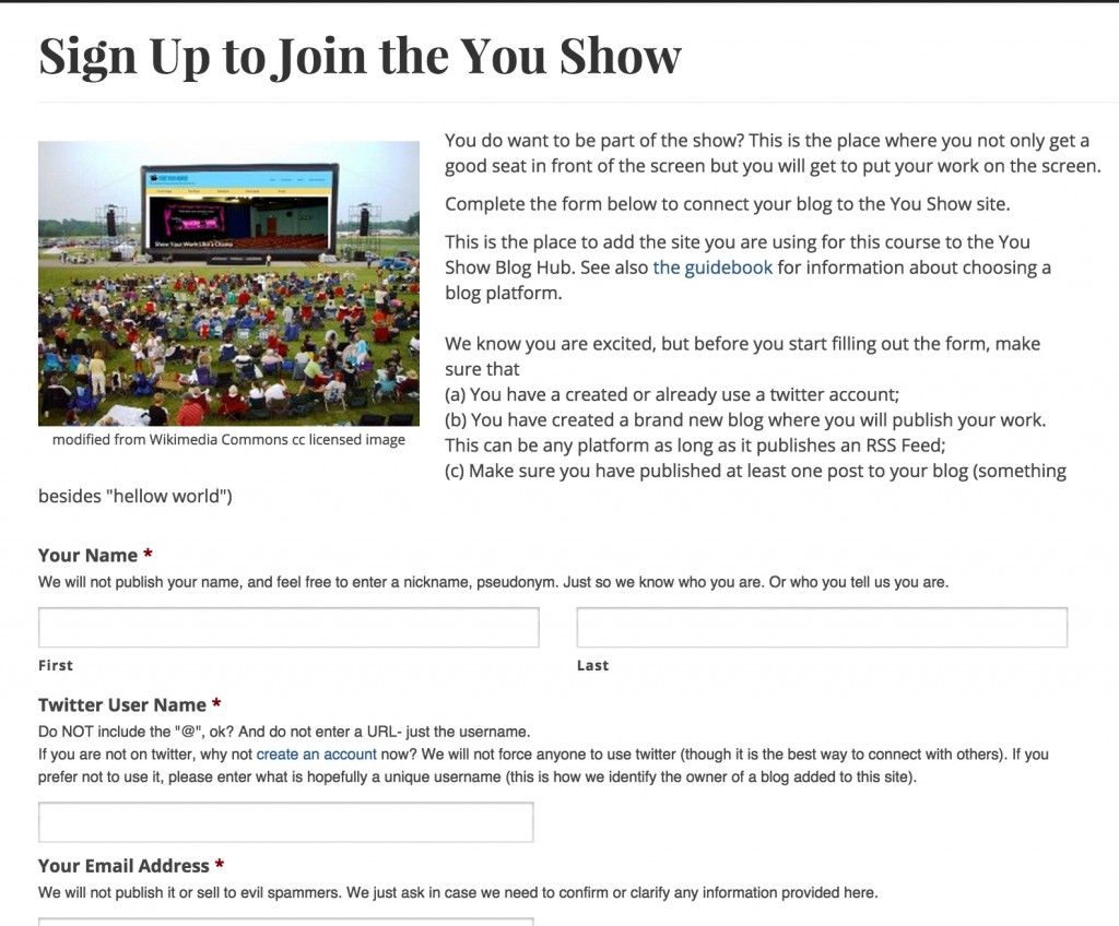
At the bottom of Getting Started (and directly via a menu link) is the Signup form.
Yes, this is another Connected Course, using Feed WordPress as an aggregator (as all explained at CogDogBlog as Feed WordPress 101).
The signup form collects the info from participants, adds a feed to the aggregator, creates a stub account for them, so we get things like the List of All Blogs (49 as of this writing, responsible for 370 posts).
Whew.
That’s only part of the site.
The events are set up via the AM Events Plugin. This creates a custom content type for all events and categories within let us split out just the Prime Time ones (guest presentations) and the Open Studio ones. The event content type lets you define start/end dates so you can have them expire from the side bar widget.
It worked reasonable well, I should have also customized the theme templates to modify the single and archive views to show the time and date info, as well as the categories you create in Events to represent venues.
A twitter account @YouShow15 was set up– I don’t like using the number, but it was the only way to get a unique tag. I made a Twitter page that displays the tweets for the account via the Twitter widgets, and added links to the archive type views you get from setting up a Martin Hawksey Twitter Tags thing in Google Docs.
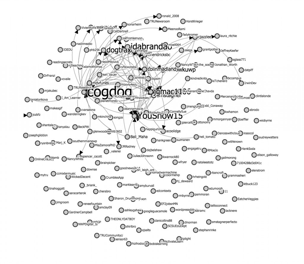
We find out there are over 1000 tweets tagged #youshow15, and in those, over 700 links shared. The Conversation Explorer, as usual produces a shape like the Star Wars Death Star:
We did not really push the twitter channel; most if it is likely me, but we do have a super sharer in Ida Brandão from Portugal.
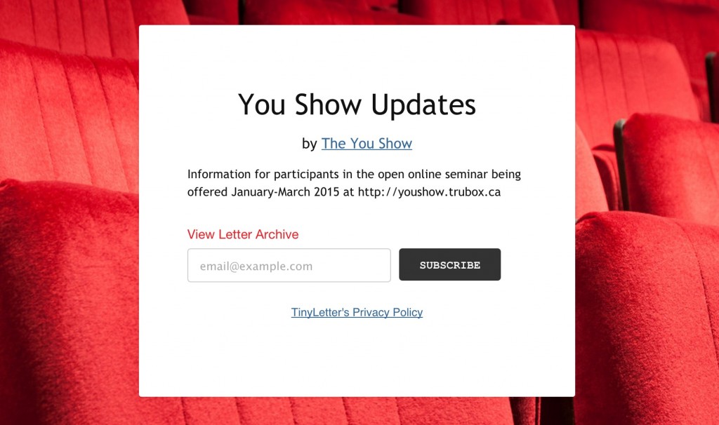
This was the first time I used Tiny Letter to create a You Show Email Newsletter. It makes it easy for people to signup (and unsubscribe). I sent about 2-3 per week, and playful goaded people at times (the archive has 15 updates listed to date).
Tiny Letter provides some metrics, if you like that thing. We have 88 subscribers, many from outside of TRU. On average, it looks like 45-50% of the emails are even opened. Because data.
Let’s go to the movies!
And of course we do have the intro videos that Brian and I did (subject to a post of their own), and for each, playing to the You Show motif, there is a backstage “Making of” post for all videos.
The site has been a bit of an evolution in progress, at least for the first 4 weeks, but has settled into a pattern. The top banner slides are updated when we do a new movie or publish a new unit. I have a master PhotoShop file with the four theaters, and each uses a layer mask to make adding a new one to the screen easy.
After writing all of this, I am now tired. It’s been great working on it- the theme was a bit challenging at first, but have to see it is quite suitable for a portfolio or general web site. I actually did not even use the built in Portfolio features – it uses custom post types for portfolio items which can be display on the front page as a carousel.
Perhaps the best design part was making the Animated GIF for the sidebar.
Because Animated GIFs.

