I’m starting to settle into this Moesia Theme (you can see it in action on the Mickey test blog, this is one I set up to allow switching of themes). I like the big splash welcome:
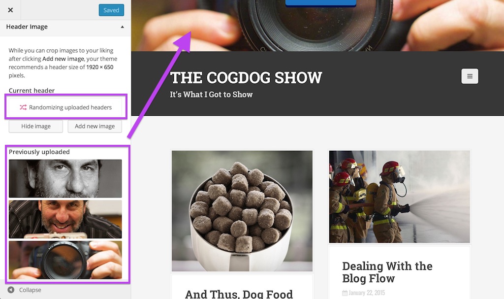
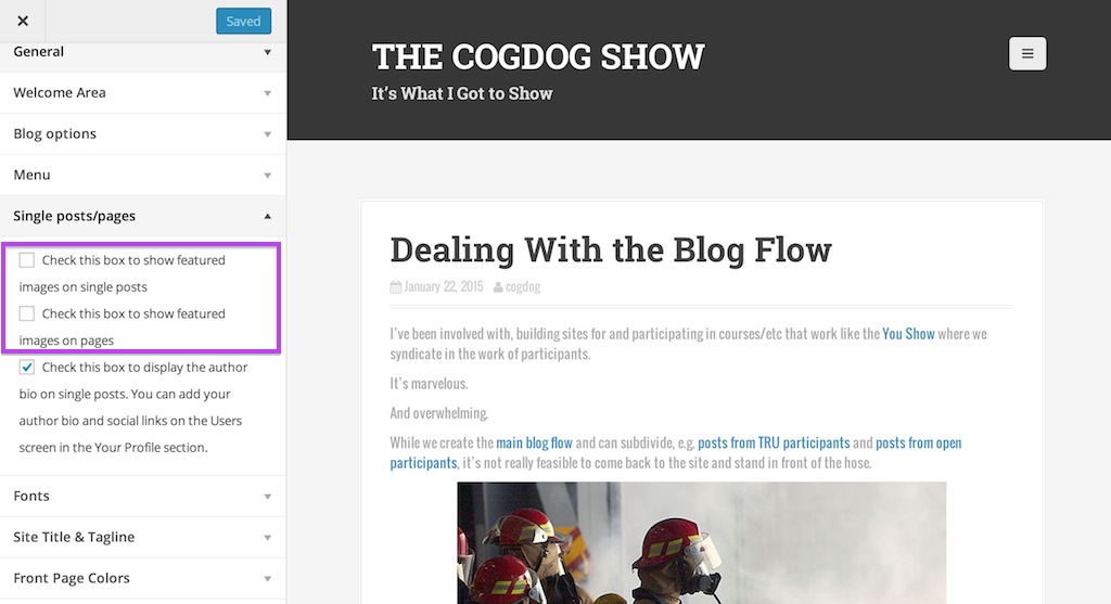
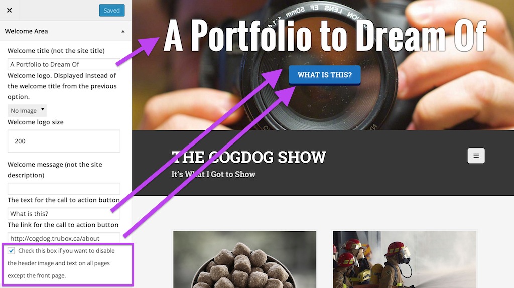
This can have text you customize, and not just the title of the blog. It has three photos it loads at random. I’ve also used the “Call to Action” button to link to my about page. And it had an option to display this big image only on the home page.
Unlike some themes that have some giant control panel, Moesia is managed via the WordPress -> Customize interface, which means you see previews of the changes as you edit.


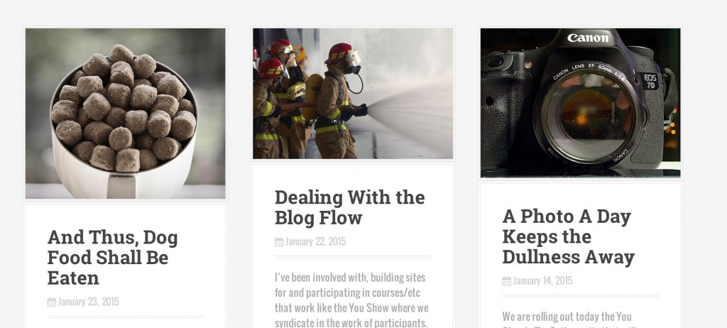
I’m still sorting out some of the features, but have been able to change the front layout to use the “masonry” style that I like in Baskverville as well.
As usual, I tend to modify these as I go, I do not get too worried about trying to fix every option at the outset.

It does have a load of its own content types, widgets and other exotic featured I have yet to try.
But I am starting to find my way around.
