A #walkmyworld remix► Play Zeega ►by Greg McVerrySo I just…

A #walkmyworld remix

► Play Zeega ►

by Greg McVerry

So I just finished this remix. It is for #walkmyworld.

I started by first reading and annotating my two sources. Today I stole from JPG’s Anti-Education Era and Marlene Scardamalia and Carl Bereiter idea of knowledge communities

I wanted to play with Gee’s work so I made a series of Gifs. One for each element of the circuit of reflective inquiry. Gee’s premis is that we are dumb alone but groups and tools can make us smarter…if we engage in the circuit of reflective inquiry. To make the gifs I just held my smart phone and used an Android App Video to Gif. Took some experimenting to get the file size down.

Then I found images from #walkmyworld to remix with Scardamalia and Bereiter’s work. All of the words are straight lifted from here.

I then end the obligatory think on this questions.

Making of a Zeega

Making of a Zeega:

I was trying to write a post of literacy and identity. It began with a search for google scholar. My computer smashed. I don’t have access to my curated literature. Not that it is tagged well. I need to get better at.

I wanted to try and write a post that meant something. That condensed these archaic academic articles into a succinct post. I admire bloggers like that. I try and tag posts like this to serve as mentor texts in class.

I didn’t happen. I got sidetracked into a more meaningful multimodal musing. 

After going back to the slideshow by Rick Beach about #walkmyworld I decided to use it to frame my piece.

That and it was too late to write a post heavy on digestible academic discourse. Besides when I usually try to cook these up I end up with a burnt turkey burger covered in vegan cheese.

I also had remix on my mind. Laura Hillinger had posted a query to #teachtheweb about remix lessons. I shared some previous ones I did but I wanted to give it the old college try.

Who’s got a project about remixing literature that I can steal from? @writingproject? Got a link? Some plan? An Etherpad? #teachtheweb

— Laura Hilliger (@epilepticrabbit) January 20, 2015

Finally I wanted to make a Zeega for #walkmyworld. We want folks playing with images and identity. So I figure let me play and co-learn.

I had a bunch of PDFs open. One of those happened to be Donna Alvermann’s piece I decided to use that piece as well.

I find remixes easier when they are anchored in more than one source or idea. It makes metaphors easier. This gets you away from literal intermodal concurrence and lets you play with meaning.

I wish I had my old computer. I would have recorded the creation process, but I will try my best to recount here:

  • I started with the four questions we asked in our #walkmyworld session and Rick Beach’s idea that we have multiple me’s that move across our digital spaces.
  • We were asking people to name their world.
  • This brought me back to the King Killer Chronicles. It opens the remix. If you haven’t read it start now. Magic in the book works by knowing the name of things. The real true name. Seriously read it.
  • I played off this naming magic because naming ourselves in hard work. I screw it up all the time.
  • I then made my two definition slides where I talk about literacy moving to literacies. I was trying to get at the idea we have rejected a model of literate and the illiterate and recognize multiple pathways to meaning making. I searched for book and dumb. You can figure out which opicture is which? What do these images say about gender identity? Searching, tagging and social media?
  • Its kinda cool though that one image looks to be in the brain of the other. Not sure if that was luck or if I did that.
  • The next slide is the point I think Rick was trying to make…or at least it is the way I am repackaging it.  Not sure what my search term  was. 
  • Zeega lets you search a bunch of web media and remix it. dogtrax probably has a comic.
  • I then went and made the 2nd and 3rd slide. I had a text structure start to formulate in my mind. Strange bc I usually have to storyboard out stuff like this.
  • I would draw my literature base on Gee and identity kits from Alvermann, stick in Ricks beginning thoughts. 
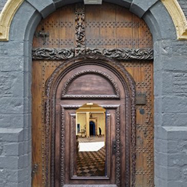
  • Then I would  use images of doors folks have posted to #walkmyworld with the four questions.
  • To capture what I meant from Gee’s identity kits I wanted to use the tired trope of using L33T when discussing youth technology. I did a quick ethnographic netography ofold gaming forums…kidding„
  • The text copied froim academia.edu just came out that way. Either DRM or incompatible fonts. Either way. Eureka.
  • The discourse page was from the method Rick suggest we use in the future. 
  • The song choice, well The Doors seemed too literal. There is mention of a door in the song, and I spent all day in the Post Office trying to figure out the most convoluted mail order practice ever.
  • I guess I made some design choices. It is fun to play with meaning, identity and pictures.

I needed to make an image for #walkmyworld. I wanted to do a…

I needed to make an image for #walkmyworld. I wanted to do a series of cascading doors and then an open image into a room. It is a loose metaphor for hwo we step in and out of different identities.

How I Did it:

I first went to flickr. I start with their creative commons page, It doesn’t work well. I click on CC BY-SA and then use a search term. I am looking at just CC BY-SA right? Nope. If you look carefully you have all licenses. You have to reselct CC images and then look closely at the license to make sure you can use and reappropriate the image.

Crediting:

I am big on crediting…well trying to get better. I tried this time I really did. I had every image open in a different window and then I tried to favorite them. I wasn’t signed on and Flickr wouldn’t let me sign in becuase I had a Yahoo (fantasy) and a Gmail (Flickr) account,.Signed in, lost images. I would have credited….Promise.

The Tech Stuff

I used pixlr editor a free editing app available in Chrome (maybe Firefox too I haven’t checked). It is a great program and does almost everything Gimp or Photoshop did.

  • I started with the first image as my base layer.
  • I then opened the second door.
  • I unlocked the layer.
  • I then used the magic wand tool to select some of the image (can give it a cool ghost like effect).
  • I then used the lasso tool (polygonal) and chose the edges of the door.
  • I copied the selection and pasted it on to the first door.
  • I then used just the lasso tool on the third door.
  • I had to resize the layers (each door was a different layer). In Pixlr (and everywhere else this is Free transform.

What I would do differently.

  • Start with the largest images. I thought I want the doors to fit in. On Flickr I will download, large, medium, small to save time. Seemed logical, bad idea.Way better to scale down than it is to scale up.
  • Blur the thethird door a bit. I would either apply a blur filter or use a smudge tool to mess up the clean lines. There is a little I guess I will call it geometric dissonance that doesn’t sit well in my gut.
  • Maybe I should have kept some of the blue frame.

#TeachTheWeb Learning Activities

I am applying for a grant to start webmaker clubs in New Haven libraries. I have been thinking about my curricular map:

Composing for the web

Learning Activity One: Hack The New York Times

Learn about HTML while putting yourself on the front page.You will:

  • Change the text of a website.
  • Change and insert hyperlinks
  • Change an image

This aligns to the following competencies in the web literacy map

  • Remixing-
  • Create something new on the web using existing resources.
  • Identify and use openly licensed work.

Composing for the web

  • Inserting hyperlinks into a web page

  • Embedding multimedia content into a web page

  • Creating web resources in ways appropriate to the medium/genre

  • Identifying and using HTML tags

Additional skills:

  • Online image hosting: People want to put images of themselves or children but do not know how to find the URL of an image or how to host an image they have on their phone online.

Learning Activity Two: Make a Meme

Learn how to change the color and placement of text using CSS.

  • Add an image using a url
  • Change the font of a text
  • Change the color of a text
  • Change the placement of a text

This aligns to the following competencies in the web literacy map:

  • Composing for the web
  • Structuring a website.

  • Creating web resources in ways appropriate to the medium/genre

  • Identifying and using HTML tags

  • Design and Accessibility
  • Identifying different parts of a website using industry recognized terms.

  • Using CSS tags to change the style and layout of a Webpage.

Learning Activity Three: Make a Business Card

Design a business card for your digital identity: You will:

  • Insert an image.
  • Learn about CSS layout and <div> overlays

This aligns to the following competencies in the Web Literacy Map

  • Design and Accessibility
  • Identifying different parts of a website using industry recognized terms.

  • Using CSS tags to change the style and layout of a Webpage.

Learning Activity Four: Make an About Me Page

We will now apply all that we learned and create an about me page you will:

  • Use additional html tags for bulleted and numbered lists.
  • Learn how to do inline formatting of texts
  • Style texts using CSS

This aligns to the following competencies in the web literacy map:

  • Composing for the web
  • Structuring a website.

  • Creating web resources in ways appropriate to the medium/genre

  • Identifying and using HTML tags

  • Design and Accessibility
  • Identifying different parts of a website using industry recognized terms.

  • Using CSS tags to change the style and layout of a Webpage.

Learning Activity Five: Memorable Quotes

We will practice our CSS layout to make a poster about one of your favorite quotes. You will:

  • Learn about the position property.
  • Learn about the float property.
  • Learn about the margin property

This aligns to the following competencies in the web literacy map:

  • Remixing-
  • Create something new on the web using existing resources.
  • Identify and use openly licensed work.

Composing for the web

  • Structuring a website

  • inserting hyperlinks into a web page

  • Embedding multimedia content into a web page

  • Creating web resources in ways appropriate to the medium/genre

  • Identifying and using HTML tags

  • Design and Accessibility
  • Identifying different parts of a website using industry recognized terms.

  • Using CSS tags to change the style and layout of a Webpage.

  • Demonstrating the difference between inline, embedded and external CSS

Learning Activity Six: Fake Facebook

In this activity you will apply what you have learned about CSS layout to make a fake facebook page for a character from a book, a hero, or a historical figure.You will:

  • Use div overlays and CSS layout
  • Use inline and embedded CSS

This aligns to the following competencies in the web literacy map:

  • Remixing-
  • Create something new on the web using existing resources.
  • Identify and use openly licensed work.

Composing for the web

  • Structuring a website

  • inserting hyperlinks into a web page

  • Embedding multimedia content into a web page

  • Creating web resources in ways appropriate to the medium/genre

  • Identifying and using HTML tags

  • Design and Accessibility
  • Identifying different parts of a website using industry recognized terms.

  • Using CSS tags to change the style and layout of a Webpage.

  • Demonstrating the difference between inline, embedded and external CSS

Performance Assessment: Create a Portfolio of your Makes

You will now use all that we have learned and the code in the learnlayout.com tutorial to build a website to show off your makes.

In addition to all of the other composing competencies covered in this module you will:

  • Improve the accessibility of a web page by modifying its color scheme and markup

  • Iterate on a design after feedback from a target audience

  • Reorganize the structure of a web page to improve its hierarchy/conceptual flow

Webmakers who successfully complete of the portfolio can apply for the composing for the web, remixing, and design and accessibility badges.

Creating a Creative Commons Tutorial

This is my first post in the YouShow series. I will not have time to keep up the the class, but I make stuff online (but I break more). I originally wrote the post on my front stage blog but the comments are so meta and the writing so stream of thought I felt it needed its own place.

This blog title is in reference to embodied nature of writing. My process is so hard to document. I could get transfixed on an idea walking the dog, playing with kids or sitting in my porcelain office.

My ideas are usually well past my skill level so writing then turns to a mixture of caffeine, cursing, and throwing things.

Since we want #walkmyworld participants to create content we also want them to  to understand the rights of makers. I decided to make a  a tutorial (mainly because I needed to learn about CC and ontainers to overlay images.)

The director’s cut:

I I do not know how to write HTML/CSS. I just steal code from elsewhere. Then I tweak it for awhile. Throw something. Walk away and posts pleas for help all over the web. That is my workflow.

This make began with me trying to learn how to add an image on top of an image in CSS. That may have even been my search terms in Google. That brought mehere.

I scrolled through the CSS and saw the multiple image overlays and thought, “That would be cool to display all of the images of CC licenses.” I figured I could do it….So I copy pasted all the code. (I still don’t know why some selectors have the same name .multiPic followed by .text1). I just new I could change the background url.

It worked. So I decided let me find one image for each of the Creative Commons licenses and add an overlay for the license and the attribution.

Then things started going wrong. I didn’t want the image url in the background of CSS. I wanted CSS that would allow me to drop in images and switch the license. Being hidden in a style sheet did me no good.

So I posted this message on discourse.webmaker.org hoping someone would respond.

(Note: I need to learn how to post code in spaces that  take markdown. I tried blockquote but it still formatted).

Then  fourtonfish responded. He defined some key terminology for me, gave me some resources (I ignored the tutorials…for now…but he inspired me to keep hacking away. Using my growing understanding I found some tutorial (couldn’t find it in my history..I tried so many)  that got me to make one div  container and put the other three divs inside of it.

It worked! I now know enough about overlays and containers to play.

…..well except the hover. So I posted another message to @fourtunfish on discourse.webmaker.org. He called me out for ignoring the tutorials and then fixed my code.

I went in and added the correct code and I did it. Just had to search for the images and copy the code a few times. I then went back into the code to add my comments. I am trying hard to use clear instructions. (I am also

I tried to add the CSS to my wordpress stylesheet. I was able to save it to the stylesheet but when I tried the html code on a page or a post the images did not overlay. That is my next task. Luckily my Wordpress theme comes with great support and Bryan Hadaway of CyberChimps is helping me try to solve the issue.

I really want the tool to work. I like to put the license in a caption or right on the photo.

 Next Episode Teaser: fourtonfish also forked my original code to show me how simple animations can be in CSS. He sent me some tutorials that will take me to   and now I want to learn how to animate stuff: