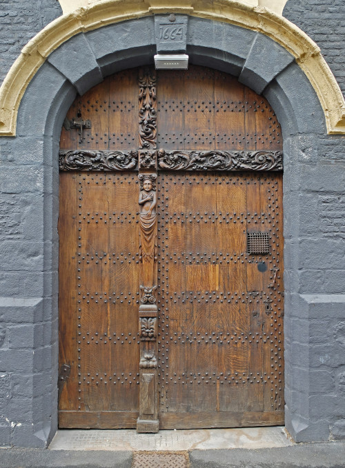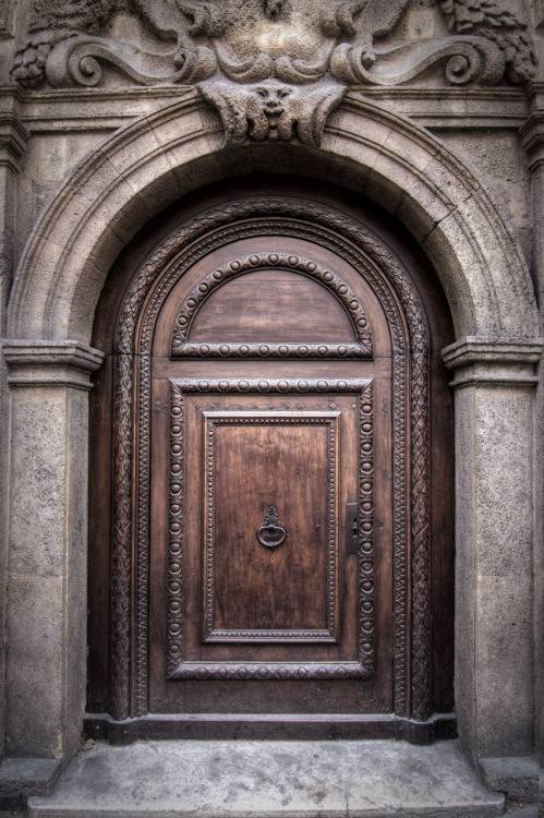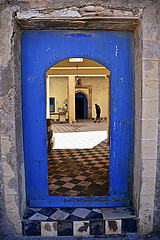


I needed to make an image for #walkmyworld. I wanted to do a series of cascading doors and then an open image into a room. It is a loose metaphor for hwo we step in and out of different identities.
How I Did it:
I first went to flickr. I start with their creative commons page, It doesn’t work well. I click on CC BY-SA and then use a search term. I am looking at just CC BY-SA right? Nope. If you look carefully you have all licenses. You have to reselct CC images and then look closely at the license to make sure you can use and reappropriate the image.
Crediting:
I am big on crediting…well trying to get better. I tried this time I really did. I had every image open in a different window and then I tried to favorite them. I wasn’t signed on and Flickr wouldn’t let me sign in becuase I had a Yahoo (fantasy) and a Gmail (Flickr) account,.Signed in, lost images. I would have credited….Promise.
The Tech Stuff
I used pixlr editor a free editing app available in Chrome (maybe Firefox too I haven’t checked). It is a great program and does almost everything Gimp or Photoshop did.
- I started with the first image as my base layer.
- I then opened the second door.
- I unlocked the layer.
- I then used the magic wand tool to select some of the image (can give it a cool ghost like effect).
- I then used the lasso tool (polygonal) and chose the edges of the door.
- I copied the selection and pasted it on to the first door.
- I then used just the lasso tool on the third door.
- I had to resize the layers (each door was a different layer). In Pixlr (and everywhere else this is Free transform.
What I would do differently.
- Start with the largest images. I thought I want the doors to fit in. On Flickr I will download, large, medium, small to save time. Seemed logical, bad idea.Way better to scale down than it is to scale up.
- Blur the thethird door a bit. I would either apply a blur filter or use a smudge tool to mess up the clean lines. There is a little I guess I will call it geometric dissonance that doesn’t sit well in my gut.
- Maybe I should have kept some of the blue frame.
