The Brief:
Continuing our work in Unit 2 of using images to visually represent ideas, concepts, ourselves, in this unit we explore concepts of how visuals are designed. In the activities we move into manipulating, editing, modifying photos and visuals with graphics software. And hopefully you can create some artifacts you can use in your show.
For your own You Show, you might be trying to figure out how to turn these blogging sites into a portfolio or front facing representation of your research or teaching. It’s more than just applying some new theme or template. We ask that for now, you continue your own backstage narration and focus on learning how to create media you can use for your project, as we move next unit into audio and then video. Rather than build it as a pre-defined portfolio from the outset, we will retrofit it later.
There are ways we will show you soon how to take the blog flow off of the front of your site, and create that outward front stage view that can work as a Final Show. The narration can either be kept off the site or moved to a place you can link to. Just keep trying to work on your web writing and media creation.
The Roughcut
In this week’s video, Brian and Alan take a rather bizarre journey to a two dimensional graphic world of Nancy White, who shares her thoughts on the role of design and the ways she uses drawing as a means for people to express and organize their work.
Event List
This is what is going on this week. For those on scene at TRU, you are welcome to come to these events; and you will get more out of the experience by joining in and meeting/learning from others (who may be equally or more confused as you). Do not expect lectures from the Film Academy, many are working/practice open studio sessions.
- Photo Walk ‘n Talk With D’Arcy Norman Tuesday January 27, 1:00pm – 3:00pm PT (check for your local time) at TRU Campus Activity Center Boardroom). Bring a camera device, any kind of laptop or computing device.
- You Show Open Office Hours via Google Hangout. Thursday January 29, 9:30-10:30AM PT. Drop in ask questions!
- Open Studio Hours. Thursday January 29 1-3pm PT and Friday January 30 10:00am-noon. Open Learning Innovation Lab (3rd floor)
The Breakdown Sheet
Open the sheet for suggested activities to work on in Unit 3. For these, you will need to use some kind of image editing software, and one that allows you to edit in layers. If you have access to something like Photoshop, use it, otherwise, in the Prop Room we have options for open source / free image editing software and drawing software including ones that you can use inside a web browser.
What Do We Mean By “Design”?
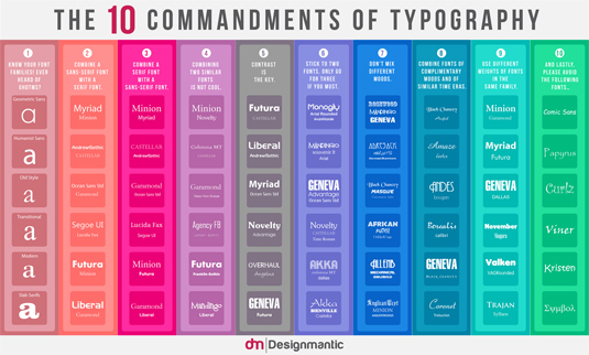
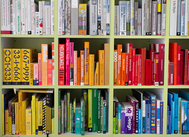
Knowing we have a number of instructional designers in the You Show group, we shall resist a definition. What we hope to have you start to notice, consider, and apply in your work with media, are elements of visual design such as color, type, space, symbols, metaphors and approaches such as minimalism. A few examples for you to start considering:
Review open document on Finding Design Elements created for DS106 and examine the concepts, the linked resource, and examples cited by previous participants. The goal here is for you to develop an understanding and recognition of elements including:
- color
- typography
- metaphors/symbols
- minimalism & use of space
- form/function/message
- balance
- rhythm
- proportion
- dominance
- unity
Following last unit’s Photo Safari, we want you to undertake a “Design Safari.” There is not a time limit for this one– carry your camera with you this week and try to capture in photos any posters, objects, advertisements, signs, etc. that you see this week that illustrate design concepts listed above.
Try to find examples of at least four elements out in the world. Write a blog post that summarizes what you found. Include:
- Embed the photo of the design element (try to make sure you get a bigger than postage stamp size in your blog).
- Where was this item found.
- Describe how this demonstrates the element of design.
Tag your post designsafari so we can aggregate them together- Add a link to your post by editing the assignment document within the proper concept areas, under the heading “Found Examples.”
YOUSHOW TIP: Sometimes we can learn just as much from badly designed things as we can from well-designed things! So feel free to include bad elements as examples to avoid.
Your Interests, in Four Icons
Branching from one of this week’s daily challenges and the ds106 assignment One Story / Four Icons, create a graphic of four symbols that represent you, your accomplishments, or your research / academic interests.
Try to find iconic symbols, not photos, not clip art, that you can assemble into a single graphic file (not just four uploads). Yes, we want you to edit in software. Perhaps the best place to look is The Noun Project (keep track of the sources of the ones you find). The final image should contain only the icons, no text.
Activity: Four Icon YouWrite a blog post including your four icon image, and be sure to include the attribution credits for the images you chose. Add some thoughts about how you think the image reflects you. Or ask some other people to look at it and ask how they interpret it’s meaning.
Drawing Together a Challenge with Five Symbols
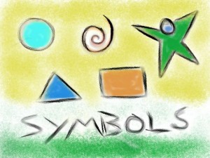
Draw a story about a challenge you face, or a common challenge, in your field or discipline using only five symbols (and no words):
- Circle = wholeness
- Rectangle = support
- Triangle = goal
- Spiral = change
- Star person [equidistant cross] = relationship
You can do this on paper or on your computer.
Write a blog post with your first draft, explaining the intended meaning of the symbols and solicit feedback via comments, twitter, or just asking people (this is how we try the “together” part). Then, redo your drawing based on their feedback, and consider how changing size, placement, and color can improve it’s representation, and add it to your original post.
Tag your post drawingtogether so we can aggregate them together.
Meme Yourself
You see them all the time in social media (often done with in appropriate taste), odd pictures with a single short text message plastered on it. Among the first examples was LOLCATS– imagining the way cats might express their view of the world

Most often silly, meme images can portray a sense of emotion. Can you make a meme image that shows your attitude about your research or academic interests?
Activity: Meme YourselfYou can find gobs of web sites that make it easy to create these kinds of images. Pick one and see what you can create. Download your image.
Next, see if you can create your own using image editing software, and use one of your own photographs. What kind of message about yourself can you create by combining a metaphorical image with a big bold text message? See some student created meme images from the DS106 What’s The Meme? assignment.
Post both of the memes created to your blog. What advantages / tradeoffs do you find in creating your own versus using a quick web tool?
Tag your post memeyourself so we can aggregate them together.
Make Yourself a Classic Poster
Movie and old war time propaganda posters provide fantastic examples of representation in a minimal graphic format. Perhaps one of the premiere designers in the field of movie posters was Saul Bass (see his archive for some examples). Notice the use of color, simple shapes, and stylized text:
![Saul Bass [Public domain], via Wikimedia Commons](https://youshow.trubox.ca/wp-content/uploads/sites/5/2015/01/256px-AnatomyMurder2-202x300.jpg)
Or how the style was created for messages in government messages:
![By attributed to John Wagner, created by the NYC Works Progress Administration, Federal Art Project [Public domain], via Wikimedia Commons](https://youshow.trubox.ca/wp-content/uploads/sites/5/2015/01/Dont_kill_our_wild_life_WPA_poster_1936-40-234x300.jpg)
Get some ideas/inspiration for posters from classic movie posters or propaganda posters. See the responses to the DS106 Propaganda Posters assignment or the DS106 Minimalist TV/Movie Poster assignment
Activity: Design a Poster About YOUSee if you can modify (or design from scratch) a poster about your work or research that uses the design aesthetic of classic examples. Or go about remixing / modifying ones available that are licensed for reuse (example) so you can try editing it to make it a message for yourself.
Writer a blog post that includes your poster, what it says about you, and be sure to include credits for any images that you incorporated from elsewhere.
Tag your post posteryourself so we can aggregate them together.
Extra Scenes
Looking for even more? A few additional resources and videos related to design.
http://vimeo.com/113751583
Learning By Design is an assignment in visual note taking.
See David Gray’s videos on Visual Thinking Basics and How to Know What to Draw.
The “must see” documentaries on design http://designers.watch/
Parting Shots
We will hear more about Ira Glass when we get to our audio unit, but in this kinetic typography style video, he expresses some key ideas about the nature of “being good” at something. Consider his advice as you venture in your You Show process.

